- Features by Edition
- Latest Features
- Licensing/Activation
- Installation
- Getting Started
- Data Sources
- Deployment/Publishing
- Server Topics
- Integration Topics
- Scaling/Performance
- Reference
- Guide to Views
- Keyboard Shortcuts
- Dates & Times
- Manage Fields
- Tokenised Data
- Using Formulae
- Scripting
- Mapping & GIS
- Advertising Options
- Legacy User Guide
- Translation Guide
- Specifications
- Video Tutorials and Reference
- Featured Videos
- Demos and screenshots
- Online Error Report
- Support
- Legal-Small Print
- Why Omniscope?
|
|
|||||
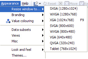
2.4 Appearance MenuAppearance Menu Commands (2.4)Managing the look and feel of your fileApplies to version 2.4 only; most of these options are available on the Settings menu 2.5 Omniscope files can be used not only to assemble, check, analyse and transform data, but also to distribute as interactive final reports and presentations for various audiences; senior management, customers, partners, friends...anyone with an Omniscope free Viewer or better. The Appearance menu commands enable you to change almost everything about the Omniscope display to conform with your desired look and feel and provide the simplest file opening experience for recipients of your files. |
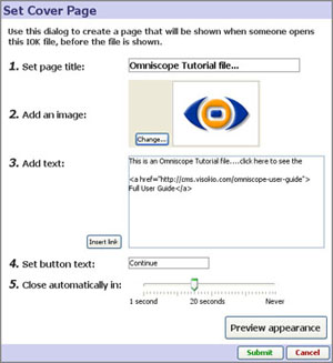 | 1. Set page title: enter text to display at the top of the page 2. Add an image: select an image to display (.JPG,.GIF,.BMP,.PNG depending on Java version) 3. Add text: add the text you wish to display, with hard returns to wrap the text evenly and keep the box size from becoming too wide. Basic HTML tags can be used to style the text Insert link: generates the full HTML to make a link you enter live. 4. Set button text: changes the text displayed in the button from 'Continue' to whatever you prefer 5. Close automatically in: sets the time delay to display the page (not used for the Help Page) |
When you are happy with your information page, click Submit to save the configuration and make the page active.
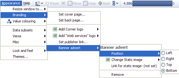
Add corner logo - allows you to replace the small Visokio logo in the upper right hand corner with a logo of your own. For best results, use a logo image about 19 pixels high. If you change the logo, the link associated with it will be changed to the URL you have entered under Set publisher link (see below).
Add Web Services logo - allows you add a logo to the Web Services menu tab on the Main Toolbar. For more information, see Configuring Web Services
Set publisher link - allows you to enter the address of a web page (URL) that will be displayed as an active link in the File > About this file notice for all files produced with your installation. If you have substituted your own logo for the Visokio corner logo, clicking on your corner logo will also take the user to this URL.
Banner adverts - Omniscope supports the display of banner adverts with live links to the advertiser on each page. The adverts can be positioned at the top, right, left or bottom of the display, and do not affect placement of header images, titles, etc. In general, rectangular images look best, such as typical full-width banner ads. Note: Server-based deployment, Flash .SWF display, embedding animated .GIF images and Report Page specific adverts are not currently supported, but this may change in future versions. For more information and examples, see Advertising Options.
Appearance > Value Colouring
Omniscope makes extensive use of colouring by values to help you and the users of your files visualise the relationships, relative magnitudes and overall meaning in your data sets. The Appearance > Value colouring sub-menu contains options to change the way ranges of values within fields (columns) are coloured. It also has options to assign colours to specific values in fields automatically and control the colour palette Omniscope uses to assign initial colours to Category values. You can override colour assignments for specific values and range endpoints at any time using the colour selectors available in Edit > Manage Fields > Configure >Field Options > Change value order, colours and shapes.
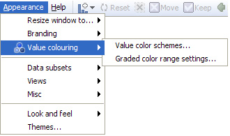
Value colour schemes - clicking launches a dialog that enables you to manage various aspects of colouring values:
Presets: a number of pre-configured combinations of settings are available, including 'Corporate Blue', 'Subdued' and 'Monochrome' colouring schemes. If you make changes to the defaults to create your own scheme, you can name it and save it for future use with specific files. To return to the default 'Classic' Presets, click on Revert to defaults.
Category fields:
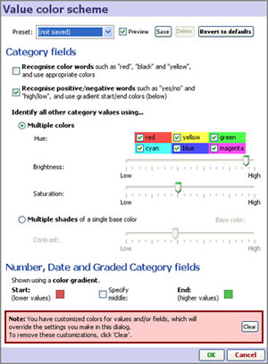 | Recognise colour & positive/negative words- when ticked, these options automatically assign pre-defined colours to recognised text values, such as 'red' or 'green' or 'yes' or 'no'. |
Number, Date and Graded Category fields - fields (columns) consisting of defined ranges of values, such as Number, Date & Time and Graded Category fields, are coloured according to a spectrum calculated based on the range between the lowest and highest values and the start (lowest) and end (highest) colour specified here. The default or 'Classic' scheme uses a range from red (lower values) to green (higher values). You can change the default here by clicking on the Start or End colours, and optionally specify a middle value to extend the colouring more or less depending on the middle colour chosen. At any time, you can change the colouring scheme applied to a specific field (column) using Edit > Manage Fields > Configure > Field options > Change value order, colours and shapes.
Note: If you do override the settings made in this dialog for one or more fields (columns), you can clear all of your customised settings using the Clear button shown above.
Graded colour ranges - this dialog determines default behaviour in colouring ranges for Number and Date & Time fields (columns).
Middle colour position: - by default, Omniscope assigns the middle colour of a range to the middle value in the field. This works well for relatively uniform distributions of values. However, if some very high or low values are present in the field, the result can 'compress' the colouring scheme such that there is not enough difference in colouring for most of the records.
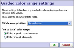
If many of your columns contain such 'skewed' distributions of values, you may want to set the default behaviour to assign the middle colour to the mean (average value), or for even more skewed distributions, to the skewed mean. If only a few fields (columns) are skewed, you may want to set the treatment of the skewed fields individually using Edit > Manage Fields > Field options > Change value colouring.
Fit to data colour range - Omniscope manages colour ranges in two modes; a filtering-neutral mode, which assigns and displays colours based on the full range of values in the field (column), and a dynamic filtering re-colouring mode, which re-calculates the range and re-assigns colours based on the range of values present in the universe being displayed. The default is the dynamic re-colouring mode, Fit range to current universe, but you can change the default setting here by selecting Fit to range of all records instead.
Appearance > Universes
Omniscope selection, filtering and basket management functions assign every record in the data set to multiple data universes. By default, every view can be opened on any of the 5 universes, and each view indicates the target universe being displayed by the colour of the corner 'eye-con' and the view selection menu.
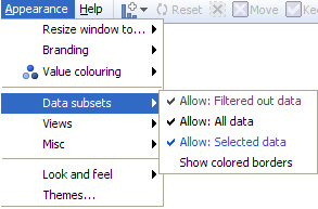
Allow OUT; ALL; SELECTION; BASKET - depending on the file and target users, you may want to simplify the menus and options by preventing views being opened on certain universes, such as the OUT or ALL universes. If these universes are not being used in Report Pages and could confuse novice users, you can prevent viewing them by removing them from the View Chooser. You can turn off access to all universes other than the IN universe by unticking them here.
Note: Users can re-enable access to universes on this menu, but not save changed versions of the file, provided you ticked the Prevent data edit/export option when you last saved the Omniscope file
Show coloured borders- this option provides for more visual impact by displaying a coloured border around each view indicating the target universe for the view.
Appearance > Views
Depending on the file and target users, you may want to simplify the display options by removing the Add View option from the Main Toolbar, or by removing certain views from the View Chooser. This could be because the view(s) are not useful, or because the size/configuration of the file makes some views slow relative to the usefulness of the view.
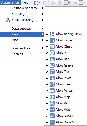
Note: Motivated users of the file can still access this menu and re-enable the view(s), so these are just menu simplification options rather than a short-cut to avoid configuring all views as meaningfully for your data as possible. However, provided you ticked the Prevent data edit/export option when you last saved the .IOK/.IOM file, any user that re-enables or otherwise changes the file settings in the Appearance menu will not be able to save or forward a persistent version of their changed .IOK/.IOM file.
Appearance > Misc
Omniscope is designed to be used for analysis, but also for distribution as final reports, for giving live presentations and for printing as static PowerPoint slides or Adobe Acrobat .PDF documents. Depending on the immediate use you have for the file, you may wish to modify certain aspects of the display:
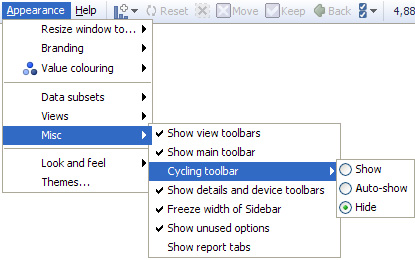
Show/hide view toolbars - untick this option to hide the View Toolbars, making the display appear more like a final report/presentation
Show/hide main toolbar - untick to hide the Main Toolbar across the top (it will always re-appear when the mouse hovers near the top of the display)
Freeze width of Side Bar(s) - untick this option to allow users to narrow or widen the Side Bars (Report Page-specific)
Show unused options - untick to simplify menus by removing references to options not used in the file.
Show report tabs - untick to hide report tabs at the top, under the Main Toolbar.
Appearance > Look and Feel
In addition to defining colouring schemes for value ranges, you can also manage the overall aesthetics of your file using the options available on the Appearance > Look and Feel sub-menu. The options available on this sub-menu are used to define Themes, combinations of settings you can use to, for example, mute the colouring application-wide to achieve a more corporate look. The best way to see the differences these settings can make is to try applying the pre-configured Themes (see below), then opening the Look and Feel dialog and noting the settings used. Note: Look and Feel menu options are Report Page-specific. To apply the same settings to all the Report Pages in your file, choose Apply these settings to all pages.
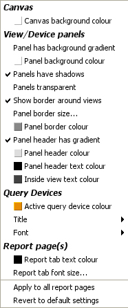 | Canvas: Canvas background colour - sets the colour of the background displayed when no view is open, in the margins, and behind the title and annotation text. Query Devices settings: (see below) Report Page(s) settings: (see below) |
Query Devices settings: (displayed on the Sidebars)
 | Active query device colour - changes the colour indicating that a filter/query device is active from the default dark orange to any other colour (purple in the example left) |
Report Page(s) settings: Tabs
Report tab text colour - sets the colour of Report Page tab text
Report tab font size - sets the size of the Report Page tab text
Appearance > Themes
Themes are combinations of settings of options for Look & Feel. A list of pre-defined Themes come with the application. You can modify these Themes, or create your own, and save your modified settings as a new Theme with a name you assign. Your Theme(s) will be saved in your program folder and will be available for use in all files you prepare with your installation. There is the option to apply the Theme to all Report Pages.
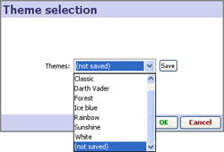
Note: From version 2.5 onwards, Themes are referred to as Styles