- Features by Edition
- Latest Features
- Licensing/Activation
- Installation
- Getting Started
- Data Sources
- Deployment/Publishing
- Server Topics
- Integration Topics
- Scaling/Performance
- Reference
- Guide to Views
- Keyboard Shortcuts
- Dates & Times
- Manage Fields
- Tokenised Data
- Using Formulae
- Scripting
- Mapping & GIS
- Advertising Options
- Legacy User Guide
- Translation Guide
- Specifications
- Video Tutorials and Reference
- Featured Videos
- Demos and screenshots
- Online Error Report
- Support
- Legal-Small Print
- Why Omniscope?
|
|
|||||
DataPlayer View (legacy)DataPlayer View (legacy)This view is no longer being developed. To use this view, you must enable Settings > Advanced > Show legacy features. Create exportable interactive Flash file for documents and the webDataPlayers are standard .SWF Flash files which contain the data, multiple visualisations and intuitive query devices used to filter the interactive display(s). DataPlayers can be created in any size, using either tabbed or simultaneous 'dashboard' layouts and any of many different view types. Interactive DataPlayers are exportable, universally-accessible Flash .SWF files for documents (PowerPoint, Excel and Adobe .PDF) and/or web pages. DataPlayers can be exported from Omniscope files using Professional or Enterprise Editions either directly into documents (with full interactivity), or as an HTML scripted target page, plus related Javascript, images and .SWF files within a single, uploadable folder, or or as standalone .SWF files for refreshing exported DataPlayer data sets by overwriting already posted .SWFs. The Omniscope DataPlayer View enables DataPlayers to be created and displayed on tabs within Omniscope files. Omniscope .IOK files should be configured with dedicated tabs for one or more exportable DataPlayers. Whenever the data in the .IOK file is refreshed from its linked source or edited from any tab, the DataPlayer(s) will be updated within their Omniscope tab(s) using the newly-refreshed data and the persistent settings in the Views sub-menus. The example below shows a tabbed configuration using each of the current views, one per tab. The Human Resources data set in the example below is the same as that included in the embedded 'How to use Omniscope.iok' tutorial file's DataPlayer tab. The data describes 111 employees of a fictional company with more than 4 years seniority.
Principal elements of all DataPlayers include: View chooser buttons (tabbed display only) - each DataPlayer can contain multiple view types. Clicking on these tabs changes the view type displayed, the order of which you can determine by changing the order of the view types in the Views drop-down menu. Simultaneous 'dashboard' display is another Appearance option. Query devices - the Omniscope Side Bar filter devices and value colouring/ordering settings displayed when the DataPlayer View is opened are replicated in the DataPlayer side filter panel. Like in Omniscope, clicking or sliding the filters in the side panel reduces the displayed record count, as displayed in the barometer at the bottom. Slider - often, there are more query devices on the side filter panel than can be displayed vertically. DataPlayers where this occurs display a vertical slider to allow the user to access the query devices below the opening set. Barometer - like Omniscope files, each DataPlayer displays a 'barometer' that indicates the number of records inside the DataPlayer, and the subset of those which are displaying given the current filter settings Details button - this button can be used at any time to display record (row) level values according to the settings for single and multiple Details display. Refresh button - like Omniscope files, clicking Refresh returns any filtered records to the visible data set, as confirmed by the barometer. Within each view, drop-down menus can be configured to give users choices of fields (columns) to display, or no options at all. Using the menu items available on the DataPlayer View Toolbar (see below), you can extend and refine the opening DataPlayer by adding other DataPlayer view types, and changing the Omniscope Side Bar filter settings to change the query devices available the filter panel generated in the DataPlayer(s) you are creating. Warning: If you have more than 10-15,000 records in the 'Filtered data (IN)' data set when you first open a DataPlayer View, current limitations in Flash may interfere with full rendering of the initial DataPlayer. It is best to first define either an Aggregation or a Named Query (or both) such that the number of records to be encapsulated in the initial default DataPlayer is reduced to under about 10,000 (depending on row count and data complexity). Caution: The DataPlayers displayed in the DataPlayer View are fully interactive, and thus it is possible to set filters, change selection drop-downs etc. just as end-users of the DataPlayer will. However, these changes are not persistent. The next time the DataPlayer View is opened and the DataPlayer re-generated, all settings will revert to the settings established in the View Toolbar Views settings menus, as described below. DataPlayer View Toolbar MenusThe DataPlayer View Toolbar includes options to create exportable DataPlayers like the example above, using defined subsets, or even all of your data.
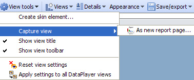
The DataPlayer View Toolbar View chooser, Data Subset selector and Aggregation drop-down menus work as they do in all Views. The functions of the other View Toolbar drop-down menus are documented below. > View ToolsThe bottom five commands on the View Tools drop-down are common to all Views and are documented here. Unlike most other views, View Tools > Capture View offers only the option of saving the DataPlayer on a new tab. Options to export DataPlayers to documents and web pages (with full interactivity) are located on the Save/export sub-menu.
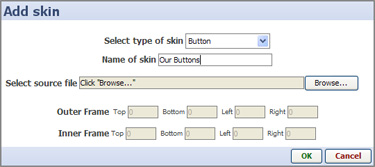
Create skin element > Add skin - DataPlayers are highly customisable. All of the principal elements of DataPlayers use skin elements that can be replaced with skin elements of your own creation. If you wish to add skin elements of your own to a file, select the type of skin element that you have created, give it the name you want to appear in the menus, select the source file containing your version, and set the Inner and Outer Frame limits. For more information on creating and using your own skin elements, see the KnowledgeBase article on modifying and creating skins.
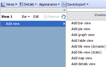
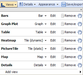
> ViewsAll of the settings governing adding additional view types and the view-specific configurations of DataPlayers are on the Views drop-down menu.
Add, change, re-order (drag the 'hands' up or down) or remove DataPlayer view types from your DataPlayer using the commands on the Views drop-down menu. Caution: It is good time-saving practise to re-order the DataPlayer view you are working on from last to first in the list. This is because each time you click 'Apply' or 'OK', the DataPlayer will be updated/re-generated with new settings, and the result will open to the first view/tab. Once all the views have been fully configured, you can re-order the views to suit your readers. The Edit sub-menu commands (including re-naming each view) specific to each view type are documented on pages accessed from the links below (or from the User Guide DataPlayer View sub-menu links at the upper left of this page). > Views > Edit command sub-menus
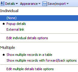
More view types are in development and will be added to future versions of Omniscope. Over time, the view types available in exportable Flash DataPlayer format will approach those available in the Omniscope project files. If you have urgent particular needs for evolution or addition of view types, please contact us. > DetailsRegardless of the number of view types in a DataPlayer (either in tabbed or simultaneous layout), options to display user-selected subsets of the records, either singly or in groups, for all of the views in a given DataPlayer are set using the Details drop-down menu.
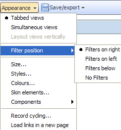
> AppearanceThe options governing the overall look and feel of the DataPlayer outside the individual view types are accessed from the Appearance drop-down menu.
Configuration sub-menus for Size, Styles, Colours, Skin elements and Components options are further documented here.
Record cycling - DataPlayers can be animated to 'step through' the highlighting of individual records, displaying Tooltips in some views Load links in new page - if you have selected Individual details display option External link, tick this option to display the results of the link in a new tab of your readers' default external browser.
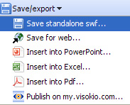
> Save/exportDataPlayers are separate Flash .SWF files which can be exported from Omniscope and inserted in documents and web pages with full interactivity. To use the document export options, your machine must have the relevant document-creation applications installed; MS PowerPoint and Excel, and either Adobe Acrobat Reader (free) or a .PDF Publisher.
Publish on my.visokio.com - you can post a DataPlayer on a blank page hosted by Visokio, then reference this page from your blog or send a link tot he page to your readers by e-mail.
More information on posting DataPlayers online
More information on inserting DataPlayers in common documents
|