- Features by Edition
- Latest Features
- Licensing/Activation
- Installation
- Getting Started
- Data Sources
- Deployment/Publishing
- Server Topics
- Integration Topics
- Scaling/Performance
- Reference
- Specifications
- Video Tutorials and Reference
- Featured Videos
- Demos and screenshots
- Online Error Report
- Support
- Legal-Small Print
- Why Omniscope?
|
|
|
|||||
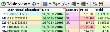
Time SeriesGraph View: Displaying Time SeriesThis section guides you through using the Connect markers (time series) options available in an expandable section of the View Tools menu of the Graph View (download the sample file used to illustrate this section here). Data Orientation for Time SeriesOmniscope manages repeated observations of values over time in vertical columns, rather than horizontal rows often used for time series in spreadsheets. To create a multi-line time series as shown below, first put your data in the following 'vertical' orientation:
In the above example of a time series data layout for Omniscope, we have various bonds, each with an ISIN identifier, and each issued by one of various countries (GR, FR etc.). We also have repeated observations of Price and Yield over time entered vertically down the columns. Each record (row) in the data file is therefore a separate observation of price and yield which are repeated over time 'vertically' in separate rows Time series data layout in Omniscope requires at least one field (column) with a natural order, such as Date, and one or more values columns 'Price', 'Yield', etc. for repeated observations of values that make up the time series. In addition, to display multiple curves on one graph, there should be a Category field (with less than about 200-250 unique values) referencing each curve to be drawn. In this example, we have many observations, but only 9 unique ISINs (individual bonds) so the curves can be plotted by the Category 'ISIN' reference field as shown in the example below. Don't worry about the apparent repetition in the data values, outside of the Table View, Omniscope will render the duplication invisible to you and the users of your files. If your data is arranged differently from the example above, (e.g. 'horizontally' with the dates as columns and each cell in the row representing an observation over time) you may want to use the the tools available under Data > De-/Re-Pivot on the Main Toolbar to transform your data set to the correct 'vertical' orientation in Omniscope. More on Using De/Re-pivot. Checking your data types: After importing and correcting the layout of your data, go to Data > Manage Fields and make sure the Time (here Date) and Observation (here Price, Yield etc.) fields (columns) have the correct data typing. They must be typed Numeric (decimal or integer), or Dates & Times. Also make sure that any fields you want to use to distinguish lines (here the ISIN Bond Identifier number) are declared of type Category. You can convert data types using the Data > Manage Fields dialog or by by right-clicking the column header in the Table View and choosing Tools > Convert field data type. Prepare the Graph ViewOnce you are sure that your data layout and field (column) data typing is correct, add a Graph View and configure the axes:
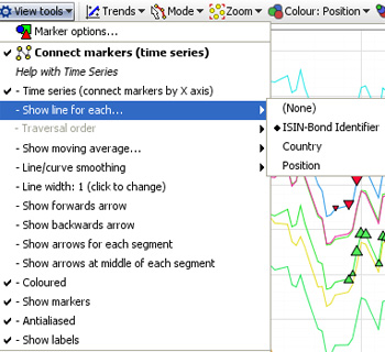
You will see an un-connected scatter plot of markers representing your time series data points. In the View Tools drop-down menu, tick Connect markers (time series). A number of new options should appear on an expandable sub-menu below this command on the View Tools menu. WARNING: This option will be unavailable if the Graph View has been configured with Displaced (randomly offset) markers. Open the Marker options dialog above on the View Tools menu and confirm that the Displaced option is not ticked. Connecting markers (time series)At this point, the display will change from unconnected scatter to connected plot, but with many heavy black lines in a jumble. The expanded sub-menu includes a number of commands used to manage the display of connected markers:
Time series (connect markers by X axis)- when ticked, automatically uses the field (column) selected for the X horizontal axis( here Date) to provide the traversal order, the order in which the dots are connected. This is the most common setting for time series. When this option is ticked, the Traversal order option below is greyed-out.
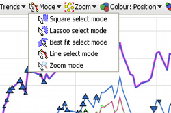
Traversal Order (showing an omni-directional path) By unticking Time series (connect markers by X axis), you can choose to draw the lines in a different order than dictated by the X axis. If you are plotting data based on criteria other than time, configure the Traversal order field appropriately. Show moving average: None; Simple & Exponential- If you have many data points in each time series, you may wish to try showing a moving average, by choosing Simple, Exponential or other data smoothing options on the sub-menu. Line/curve smoothing- By default, lines are turned into curves while preserving data points. In other words, curves are drawn between the data points. Depending on your data, this may be inappropriate. You can disable this using the Line/curve smoothing sub-menu. Alternatively, a second form of curve smoothing is provided, which does not pass through the data points. Untick Curves pass through vertex points to use this option. Both forms of smoothing can be adjusted for amount of smoothing using the Smoothing amount option. Line width-By default, lines are shown 2 pixels thick. Use the slider to change this any value between 1 and 25 pixels. Arrows: Show forward arrow; backward arrow; arrows for each segment; middle of each segment-adds different kinds of directional arrow heads to the line segments displayed Coloured- By default, if you have multiple lines displayed, these are coloured according to the values in the Category field. You can disable this and show only black lines by deselecting this option. Show markers- Hides or reveals the markers within the plotted lines (to resize markers, see Marker Options on the View Tools menu Anti-aliased- Smooths the way the line is displayed Show labels- By default, text labels will be shown beside each line if you have multiple lines. By de-selecting Show labels, these will only be shown as you move the mouse pointer over a line. Making line selectionsWhen Connect markers (time series) is enabled and lines are showing, the Line select mode becomes available from the Modes drop-down. Select this mode, and the mouse pointer will change to show that you are in Line select mode. Move the mouse pointer over a line, and it will become highlighted.
There are two ways to select records in Line select mode:
Stuck? Reset the Graph ViewIf you have made too many configuration changes and can't figure out how to get back, you can reset all settings for the current Graph View, returning to a plain default view with no marker connection settings enabled. From the bottom of the View Tools menu, choose Reset all settings for this Graph view.
|